Tuesday, December 11, 2012

A Quick Peruse of History

Beatus of Fernando and Sancha
Illuminated Manuscript
1047 CE

Albrecht Dürer
Printing Press/German Illustration
1515

Rand and Avery Foundry
Typefaces in the Industrial Revolution
1867

Eadweard Muybridge
Early Photography (Sequence)
1883

 Siegfried Bing
Imitation of Japanese Woodcuts, leading to Art Nouveau
1888

The Beggarstaffs
Pictorial Modernism
1896


 Theophile-Alexandre Steinlen
Art Nouveau
1897

 Currier Lithograph Co.
Chromolithography Advertising
1899

The Craftsman, Artist Unknown
Arts and Crafts Movement
1915

Edward Penfield
Pictorial Modernism
1917

 Vladimir Vasilevich Lebedev
De Stigl
1928

Alexey Brodovitch/Herbert Matter
Modern Photography
1940
 
Paul Rand
The New York School
1940

Josef Müller-Brockmann
International Typographic Style
1954
 Victor Moscoso
Conceptual
1967

Waldemar Swierzy
Conceptual
1974

Michael Manwaring
Postmodern Design
1984

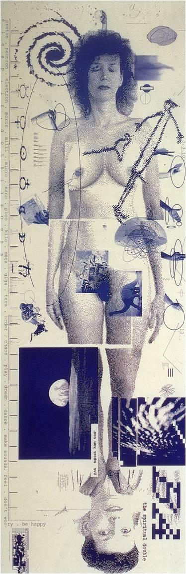
April Greiman
Digital Revolution, Print
1987

 Aaron Koblin
Digital Revolution, Interactive
2005

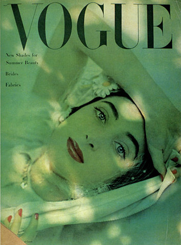
Martha Stewart Living Magazine
Digital Revolution, Portable Devices
2010
(I tried to find a moving gif of the peony opening but the internet searches haven't figured out how to let me do that yet - it's probably on tumblr somewhere but tumblr tag searching is sadly lacking in the specificity needed to find it)

Tuesday, November 20, 2012

Screening Notes for Milton Glaser

Oh I already like this guy, he drew and copied comics as a kid, which is an artistic start I identify with a lot.

I really love this guy's easy-going philosophies and his simple artistic genius, and how humble he is about everything. We're talking about the guy who came up with the "I heart NY" design - something that I would argue was one of the world's biggest pre-internet memes. It's something that's still relevant and altered and used in the present day. I especially liked the examples that popped up from his time working for grocers. It reminded me of the graphic design I am surrounded with every day I go to work at my retail job, and how much of it pains me. If some of these artists went back to the graphic design roots like what Milton does, stocking would be filled with a lot more interest for me. I am struck by how awful some of the designs are these days and I really wish the people working for these modern companies had the kind of work ethic Milton has, or that they had teachers like Milton when they were studying this profession.


Screening Notes for Herbert Matter

Herbert Matter is a name I'd never heard before starting this documentary. I got to discover Herbert's life as it unfolded. And it seemed like he could never stop surprising me with how he embraced each new form of art as it came along. He went from drawing with his hands to photography (inventing photographic collage along the way) to video art. Matter had personal relationships with famous artists like Eames and Pollock. His close relationship with Pollock greatly influenced both of their work.

I have probably seen tons of Matter's work throughout my life and my career as an art student, and never realized it. He created so much and such varied types of art throughout his lifetime, yet all of it has a very consistant feel to it. Everything he's done is incredibly genuine. He was a prominent artist who was extremely active during the actual birth of the graphic design field.

Oh now I'm at the sad part where his family is sad about how he didn't really pay them much attention, in favor of his work. He may have been a genius, a graphic designer ahead of his time at all times, but what does that all matter if you've never taken a photo of your own son? It brings up interesting questions, such as is the massive body of work he left behind worth the gaps he left in his family? Balancing passion with family, or having equal passion for people as you do for art, I think is something a lot of people still struggle with.

But I don't think I would enjoy being a genius artist if I had no one to share it with. I found his relationship with Pollock very inspirational, since that kind of artist to artist friendship is critical. But the end of Herbert's life just seems... sad.


Thursday, November 15, 2012

Screening Notes for Eames

Wait a second, before I say anything I just gotta get something off my chest.

CHARLES EAMES IS A CHEATER MC-CHEATER PANTS

Now... with that out of the way.

I was amazed during this entire program how the studio spaces and furniture and interior design could have easily been pictures of modern interiors that I would reblog on my tumblr. In fact the only indications I had of the time period in which the Eames did their greatest work was in the narration and advertisements presented on the screen.

That being said, the natural conclusion is that the Eames ended up shaping a new form of design that became the new classic. The designs not only inform modern designs, but also still exist in the world as what we may call retro or throwback designs. Their appeal continues to be relevant because what the Eames studio created is based on universal aesthetic ideals and on ideas of efficiency of form, affordable manufacturing practices, and practicality.

Their lives and work support my belief that the best artists are well-rounded ones that are informed by many different areas of work, which is the main reason why I try to experiment and learn as many different art forms as I can. If I'm not a natural at it, I will at least try it. It was Ray's painting and design background combined with Charles' disposition for architecture and natural creativity that created that perfect marriage of art and industry to create some of the most well-designed household pieces of the century in America.

The breadth of their interests meant they were also active in other art forms such as video, home design and construction, and overall communication arts. They shaped a large portion of the modern art world.


Sunday, October 28, 2012

Screening Notes for "Helvetica"


I'm still in the intro but wow I love the background score.

Helvetica is the most common typeface, it's used everywhere and on anything. It's the most versatile typeface in the world, if it's widespread use is any indication.

I honestly haven't thought much of typefaces. My favorite is Garamond, but that is purely a personal attraction to the way it looks - it reminds me of old books without being illegible. I never took typography so I don't know what types are related and which aren't. I guess I never noticed Helvetica because I never noticed it, never saw how often it was used. I'm aware of Times and Ariel and Calibri due to their default statuses in my computer programs. Comic Sans is infamous as a terrible font. I think I remember someone saying that you can tell if a font is successful, because it works so well with the work that you don't even notice it.

1950s Swiss Style is where Helvetica emerges. The style of the posters they used as examples in this video really appeal to me in their simplicity and clarity of message.
Oh, I love this! This quote, about how a computer does not improve your design, it only speeds up the process.

Helvetica is a bit of a mystery. Mostly it was a generation to generation perfection of an old sans serif font, tweaks made in spurts that lead the modern font. "Helvetica" came about when the longer name ending in Grotesk was said it would not sell well in America. Helvetica is the altered latin name of Switzerland. Helvetica was extremely successful almost as soon as it was introduced.

Advertising went from being flowery and people-focused to being decisive and product-focused. Everything from advertisements to government forms and documents to business logos to street signs is in helvetica. It's simple and easy to understand, it reads as trustworthy and efficient. The context controls the interpretation of Helvetica.

Confusingly for me, I went to my font list on WordPad to see if I could play with the font and experience it myself, and it's not there. If it's such a standard and widely-used font, why would it not be in every word processor ever made?

Aw yeah we're getting into media. Music, TV shows, Movies, Branding - they all use variations of Helvetica. Some designers avoid it because of an abhorance of conformity. "Don't use Helvetica" is a rule that some artists adopt in order to avoid being stagnant. Using Helvetica is seen as agreeing with the ideas of the people who used it before, and when those ideas didn't match up, the typist rebelled.

The grunge typography aesthetic kind of stemmed from this, from people who wanted to rebel against the boring way of doing things at the time. After grunge had broken it all down, then they could return to the classics with a new mindset and really make it work in a different way than it did before.

I love that typography and graphic design is available to more people in the modern day, anybody altering their own blog or social network profile and choosing fonts and colors and spacing is practicing these aspects. I think over time I'm learning that graphic design isn't just about advertising or sending me subliminal messages. It's about communication. And sometimes communication becomes beautiful.